My website is basically ready for desktop! But, I've been thinking of making it mobile-friendly too. The reason is that people use smartphones wayyyy more than PCs, it's cheaper, more accessible, and possibly more important since it's used for communications amongst other things. But how do I start? Do I just move things around? Do I need to make a completely different site for mobile?
Thing is, it's actually best to start making a website with mobile in hand at first. I was aware of this, but I thought it'd be an interesting to make a website like from the 90s/00s and learn how the transition to adapting to different screen sizes works out. So if you have a desktop website ready like me, then maybe my journey could help you out!
I found a tutorial that explains responsive web design in a very simple manner (Responsibe Design in 3 steps). So start off with adding this line in every HTML file. In one of my earlier posts, I mentioned adding a meta tag I found in the Zonelets files when inspecting them. It's this very line:
<meta name="viewport" content="width=device-width, initial-scale=1.0">
There's a bit about adapting for Internet Explorer. But since that's a deprecated browser, that can be skipped.
Next in the tutorial mentions about using the media technique for different screen sizes. I found a link that has a table mentioning different min-widths to use for various devices (min-widths and max-widths).
But since a lot of the links start with mobile first designs, I'll have to do a few things differently. I'll be tackling this by using the same classes in CSS, but changing certain properties for mobile. For instance, I don't want my main navigation bar to be in a row on mobile, so I'll change the flex direction for it as well as all related classes:
/*-------------------------------------*
 * Adaptive HTML Styling
 *-------------------------------------*/
/*Tablets and mobile */
@media (max-width: 768px) {
 .row{
  flex-direction: column;

 }
 .column-left,.column-middle,.column-right{
  flex:none;
  width: 100%;
    box-sizing: border-box;

 }
 .nav-bar {
  list-style: none; /* Remove bullet points */
  display: block;
  justify-content: center;
  align-items: center;
  align-self: center;
  padding-bottom: 2dvh;
}
.nav-bar li {
  margin-bottom: 30px;
}
}
This basically converts the nav bar from horizontal to vertical for single column scrolling.
However, when I tested it and looked at it, I didn't really like the outcome. Still, I'm keeping the code here if anyone is interested in knowing how it worked for me. So I thought, maybe I can have less space by keeping the nav bar horizontal, but make it scrollable instead! The nav bar needs to be the same as your desktop version for the most part, but W3Schools says the key to applying a scrollable property (W3Schools Horizontal scroll) is to use overflow:auto and white-space: nowrap:. Like this:
/*-------------------------------------*
 * Adaptive HTML Styling
 *-------------------------------------*/
/*Tablets and mobile */
@media (max-width: 768px) {
  .row {
    flex-direction: row;
  }
  .column-left,
  .column-middle,
  .column-right {
    flex: none;
    width: 100%;
    box-sizing: border-box;
  }
  .nav-bar {
    list-style: none; /* Remove bullet points */
    display: flex;
    justify-content: center;
    align-items: center;
    align-self: center;
    padding-bottom: 2dvh;
    overflow: auto;
  white-space: nowrap;
  }
  .nav-bar li {
    margin-bottom: 30px; /*Add spacing*/
  }
}
Now the nav bar is scrollable! But it looks kind of messy, especially with how the buttons overflow from the edges. When looking at the Overflow property in W3Schools, I saw something that deals with only the left/right aspects of it called overflow-x. So I'm replacing my overflow property with that. Next, I wanted to check about any properties related to scrolling. The regular scroll-behaviour property didn't do anything, and I checked other scroll properties until finding scroll-align-type. This has a snap and focus effect when the scrolling is done. This doesn't make a big difference, but I can already see that the scrollbar is behaving a little differently.
 .nav-bar {
    list-style: none; /* Remove bullet points */
    display: flex;
    justify-content: center;
    align-items: center;
    align-self: center;
    padding-bottom: 2dvh;
    overflow-x: auto;
  white-space: nowrap;
 scroll-snap-type: x mandatory;
  }
But now I need the actual snapping to display buttons one at a time at the center. So I look to the li class which handles the buttons. I add a display: flex property for responsiveness, and align with justify-content: center. Like scroll-snap-type, there's also scroll-snap-align, which aligns elements after scrolling is done. I want it at the center. But in order for reactivity to fully work, I need to adjust the flex itself via its property. Flex's format consists of grow, shrink, and basis. Grow and shrink determine how the element will be bigger or smaller based on the other elements around. I don't want other elements present except one button at a time, so I used 0 0. Basis determines the length of the item. In my case, it determines the distance between each button. Putting something like 10% gives small spacings, but 100% shows one button at a time.
  .nav-bar li {
    margin-bottom: 30px; /*Add spacing*/
    display: flex;
    justify-content: center;
    scroll-snap-align: center;
    flex: 0 0 100%;
  }
I still need to polish it however, as I only see 3 buttons displayed. I noticed the issue isn't with my media query, but how my widths are structured for desktop viewing which causes the cutoff. The easy trick I found is to just use justify-content: flex-start; Which will automatically align the content to start from the left. I also removed any unnecessary extras that might be getting in the way as they're already on the desktop versions of the classes.
@media (max-width: 768px) {
  .column-left,
  .column-middle,
  .column-right {
    flex: none;
    width: 100%;
    box-sizing: border-box;
  }
  .nav-bar {
    display: flex;
    overflow-x: auto;
    white-space: nowrap;
    scroll-snap-type: x mandatory;
     justify-content: flex-start;
  }
  .nav-bar li {
    display: flex;
    justify-content: center;
    scroll-snap-align: center;
    flex: 0 0 100%;
  }

}
Hooray! Lastly, I want to change the colour of the scrollbars for all device screens for consistency. Weirdly enough, there's no standard way to do this despite this being such a basic function. Most browsers have a single method, except for Firefox which uses another method. I'll be doing both.
Starting with Firefox, which is really easy. If you have a body class like me, just add in the scrollbar-width, and the scrollbar-color (format thumb and track which is basically the scrolling part, and the background). Add this in your nav-bar media query too.
scrollbar-width: thin;
scrollbar-color: #ff0000 #0b0e14;
As for other browsers, you need to create multiple pseudoclasses for body based on hovering, track,thumb, and the general class using ::-webkit-scrollbar outside media query. For the media query itself, you need to replace body with your navbar class.
body::-webkit-scrollbar {
  width: 10px;
}
body::-webkit-scrollbar-track {
  background: #0b0e14;
}
body::-webkit-scrollbar-thumb {
  background: #ff0000;
  border-radius: 5px;
}
body::-webkit-scrollbar-thumb:hover {
  background: #ff5a5a;
}
If you want your main scrollbar on the right to also change, then just make a class. I'm naming mine html so I don't need to add anything on my actual page:
html {
  scrollbar-width: thin;
  scrollbar-color: #ff0000 #0b0e14;
}
/* For non Firefox browsers*/
html::-webkit-scrollbar {
  width: 10px;
}

html::-webkit-scrollbar-track {
  background: #0b0e14;
}

html::-webkit-scrollbar-thumb {
  background-color: #ff0000;
  border-radius: 6px;
  border: 3px solid #0b0e14;
}
Great, my navbar is now mobile friendly! Next up, I want to work on rearranging the alignment to be mobile friendly too. Since non-desktop devices are smaller, they can't accommodate the 3 column format I have. So I want to display the site in a single column and in a particular order. Most of my pages have things in the middle and right column, so I'll have the left column appear first just to get it out of the way. Considering that my right column tends to contain something related to the user, such as navigation and searching, that will be the second thing to appear. The middle column will appear last, since that is what the user will be looking at and scrolling on the most.
To rearrange the order, you use the order property and add in a number in each class inside your media query.
  .column-left {
    order: 1;

  }
  .column-right {
    order: 2;

  }
  .column-middle {
    order: 3;

  }
You'll now notice that based on the number you gave, the order has shifted around. Next, bring everything to a single column by changing your flex-direction to column using the class it's assigned to. For the columns, use the same properties but modify them. For instance, there's no need to grow or shrink the flex since it's one column. But you can still get it to stretch wider if needed using max-width. Like this:
 .row {
    flex-direction: column;
  }
  .column-left,
  .column-middle,
  .column-right {
    flex: 0 0 auto;
    max-width: 100%;
  }

Great, it works! Now if you had any overlapping issues with elements (which I did like this picture above), then make sure that your widths and margins in your desktop sections are flexible by adjusting the values to be more consistent with working elements, or use auto. Also make sure that your closing divs are being placed properly.Lastly, I just need to make a few alignment changes to ensure all of them stay in the center.
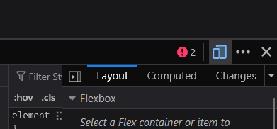
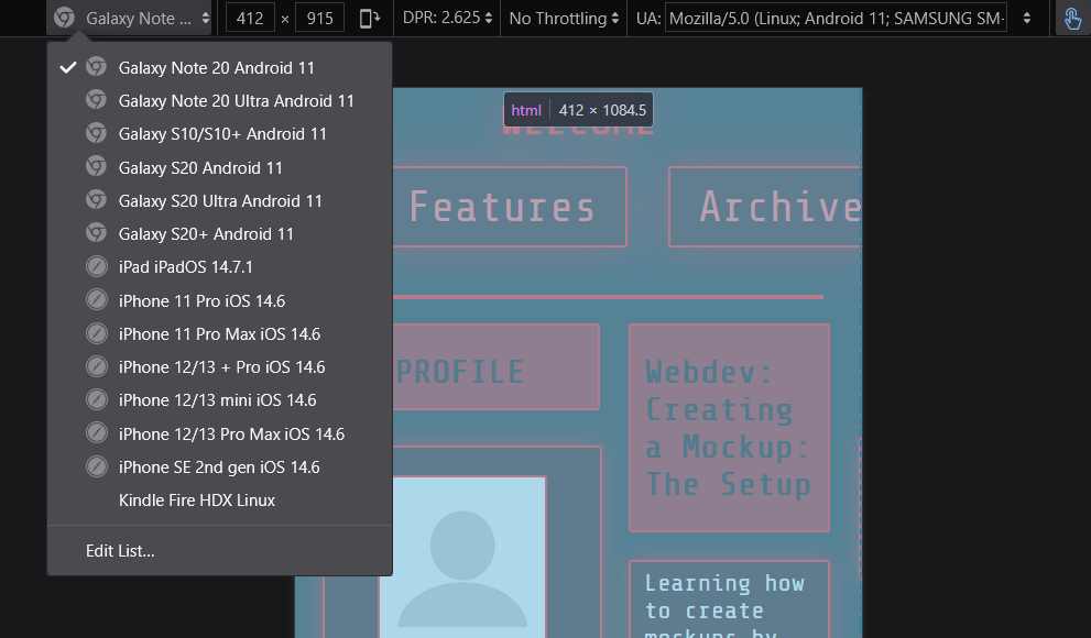
You can also emulate mobile devices! On Firefox, if you have inspect element on, you can press this little mobile icon on the right to open mobile view and see the difference. See if your text is readable enough on different screen sizes by selecting different devices on the first dropdown list on the left.
Awesome! Our website is now responsive for a bunch of screens! There are a bunch of tools and sites that can check what your site may be lacking:
W3 evaluation tool