Now that the homepage is (somewhat) done, I'm going to work on the about page. This time I hope that there'll at least be a bit more purpose as to what I want to add so that it'll help me categorize things easier. I didn't spend too much time on the about page. I want to keep the format as consistent as possible, because I'm also low-key thinking about making it mobile-friendly in the future.
This basic layout isn't difficult to create, because we already did most of the hard work! What you are going to need however, is a new html file dedicated to this new section. Copy and paste whatever common code is needed. Also if your page has a highlighted button in the navigation bar like mine, then make sure to change the active class and also change the href to the name of the html files!
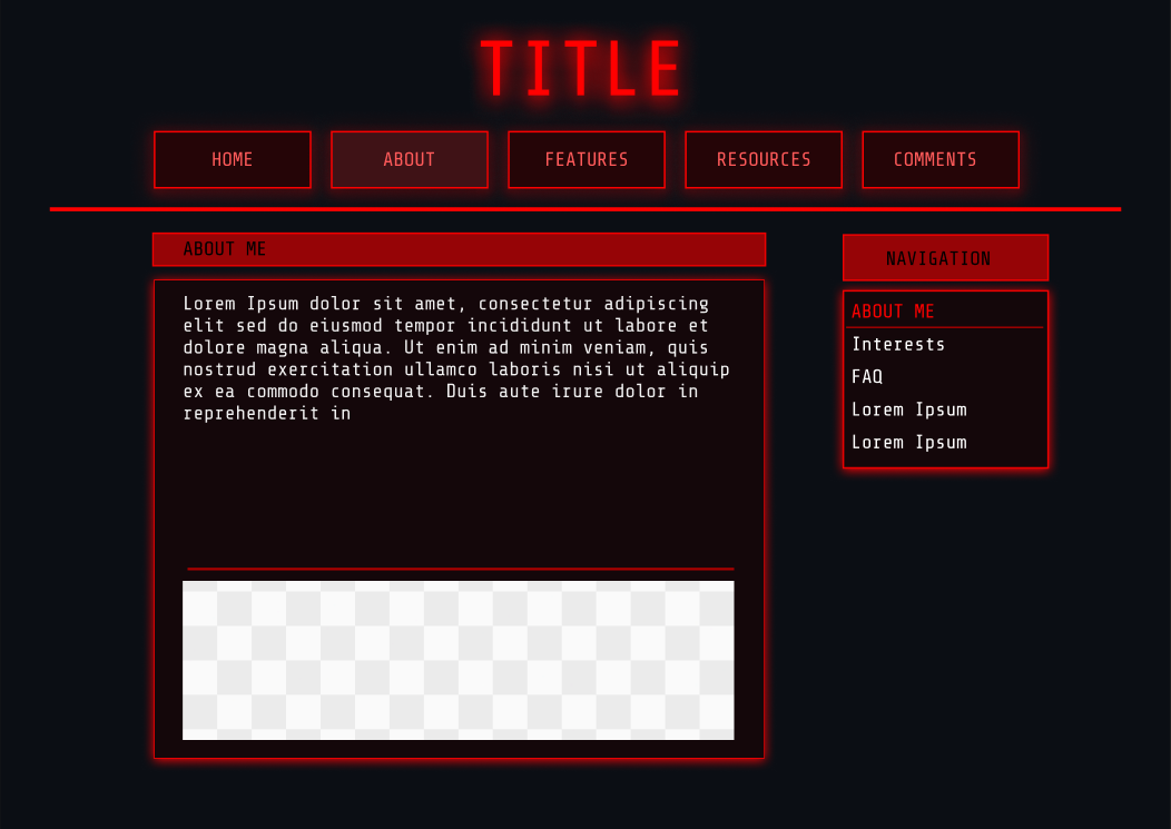 My vertical nav bar for the about page mostly has a similar format as the nav bar I made for the site, but I made sure the flex-direction is a column and I also added a border-bottom for decoration when it hovers. The whole code looks something like this:
/*decorative box*/
.about-section-body {
  display: flex;
  flex-direction: column;
  align-self: center;
 background-color: #1D0000;
 border: 2px solid #EF0000;
 border-radius: 2px;
 padding: 0px 0px 0px 10px;
 margin: 20px auto 0px auto; /* Format: Top, right, bottom, left */
 width: 90%;
 height: auto; /*height is adjusted based on content*/
 max-width: 100%;
 box-shadow:0 0 15px rgba(251, 0, 0, 0.5); /*Format: X, Y, glow amount, color */
}

.about-nav
{
 list-style: none; /* Remove bullet points */
  display: flex;
  flex-direction: column;
  display: flex;
    justify-content: center;
  align-items: center;
  width: 95%;
  margin-bottom: 5px;

}

.about-nav li {
  display: block;
  width:  100%;
  padding: 10px 0px 10px;
  text-align: left;

}

.about-nav ul{

  list-style-type: none;
  margin: 0;
  padding: 0;
  width: 100%;
  color: #F0F0F0;

}

.about-nav li:hover {
  cursor: pointer;
   border-bottom: 2px solid #EF0000;
  color: #EF0000;

}
I also realized that I had to create separate classes for each of these decorative headers I was making because of the certain dimensions I wanted for some of them, so it was hard to make a generic class. Annoying, but this is something I'll need to reflect on in the future so that I can make this easier to implement.
The next thing I want to do is make my about page change info based on what's being selected in the navigation bar. I can't find resources on this, but I've seen some neocities sites do this (velvetblue, ne0nbandit) and so I'll be inspecting it. One thing I've been delaying so far for some reason is learning how to actually read inspect element (which I've been assuming things up to now). I watched a useful tutorial that helped break it down for me: YouTube tutorial on inspect element by ROOTs Technology
Looking at the code, I found that each selection has an onclick component and the name of the function to execute it. Also, all related elements such as your navigation bar text and the actual texts need to have their own id class to be referenced. There should be at least one default id to show whenever someone goes to the about page. The rest that has to be selected needs to be hidden.
Next, I decided to tackle an easy task. I copy pasted the code I used for the top navigation bar for the about navigation bar, that way the default selection is active and then removed when it's not clicked on. I just changed the IDs. The result shows the About Me selection to be highlighted by default, and then get deselected when something else is chosen. The advantage of this is if you use the same class in any other page, this gets applied there too!
Making this about page work took quite a while. I tried figuring out how other people did it but I found it quite hard, and neocities' editor kept giving some error for some reason, even though I tried it on another editor (Visual Studio) and there were no errors at all. So I had to come up with a more basic, and redundant way of doing this. I'm sure there's a better way, but this works for now until I learn a better method.
First, I added the following classes and IDs to these tags. I'm using the about me section as an example:
//title
 <h2 id="aboutme-title">ABOUT ME</h2>
//content
<div id="aboutDefault" >
     <p class="paragraph"> This is an About Me post by default.</p>
  </div><!--Close aboutDefault-->
//image (if being used)
      <
img src="imagelinkplaceholder" alt="image placed here" class="posts-images" id="aboutme-image">
//navigation selection
  <li href="#"  class="active">About Me</li> <!-- This is the default selection-->
Then, I made a function that should show the about me content on load, and hide the rest. This mostly uses the style.display: method.
//Event listener for about page nav bar load. Make about me section appear by default and hide others.

document.addEventListener("DOMContentLoaded",function()
{
   document.getElementById("aboutDefault").style.display="block"; //about me title appears by default
     document.getElementById("aboutme-title").style.display="block";  //about me section appears by default
     document.getElementById("aboutme-image").style.display="block";  //about me image appears by default

//other sections are hidden by default
//other sections are hidden by default
 document.getElementById("faq-title").style.display="none";
 document.getElementById("interests-title").style.display="none";
 document.getElementById("aboutFAQ").style.display="none";
 document.getElementById("aboutInterests").style.display="none";
 document.getElementById("interests-image").style.display = "none";
 document.getElementById("faq-image").style.display = "none";
Then, I made a function that should show the about me content on load, and hide the rest. This mostly uses the style.display: method.
//Event listener for about page nav bar load. Make about me section appear by default and hide others.

document.addEventListener("DOMContentLoaded",function()
{
   document.getElementById("aboutDefault").style.display="block"; //about me title appears by default
     document.getElementById("aboutme-title").style.display="block";
     document.getElementById("aboutme-image").style.display="block";

//other sections are hidden by default
//other sections are hidden by default
 document.getElementById("faq-title").style.display="none";
 document.getElementById("interests-title").style.display="none";
 document.getElementById("aboutFAQ").style.display="none";
 document.getElementById("aboutInterests").style.display="none";
 document.getElementById("interests-image").style.display = "none";
 document.getElementById("faq-image").style.display = "none";
Lastly, I made a function referencing the content and title ids and hide everything related to that by default. This is used so that when it's not active, it goes off. I then used a const to check which button is currently active, and referenced that in my if else statements to show content based on what's active:
  //Change content in about page based on clicks

  function changeAbout(contentId,titleId) {

    //hide all sections when not in use
  document.getElementById("aboutDefault").style.display = "none";
  document.getElementById("aboutme-title").style.display = "none";
  document.getElementById("aboutme-image").style.display = "none";
  document.getElementById("interests-title").style.display = "none";
  document.getElementById("aboutInterests").style.display = "none";
  document.getElementById("interests-image").style.display = "none";
  document.getElementById("faq-title").style.display = "none";
  document.getElementById("aboutFAQ").style.display = "none";
  document.getElementById("faq-image").style.display = "none";
I then used a const to check which button is currently active, and referenced that in my if else statements to show content based on what's active. To make it easier (considering I used a mix of upper and lower case letters in my selections such as About Me and FAQ), I convert all of them into lower case and also remove any spaces so that it's easier for JS to recognize them. I used textContent.trim().toLowerCase() to do that:
 //check for active button
  const activeAboutButton = document.querySelector(".about-nav li.active");
if (!activeAboutButton) return;

//use comparison in html and convert to lower case
const selectedButton = activeAboutButton.textContent.trim().toLowerCase();

//check which button is selected and display accordingly
if(selectedButton === "about me")
{
   document.getElementById("aboutDefault").style.display = "block";
  document.getElementById("aboutme-title").style.display = "block";
  document.getElementById("aboutme-image").style.display = "block";
}
else if(selectedButton === "interests")
{
  document.getElementById("interests-title").style.display = "block";
  document.getElementById("aboutInterests").style.display = "block";
  document.getElementById("interests-image").style.display = "block";

}
else if (selectedButton === "faq")
{
  document.getElementById("faq-title").style.display = "block";
  document.getElementById("aboutFAQ").style.display = "block";
  document.getElementById("faq-image").style.display = "block";

}

  }
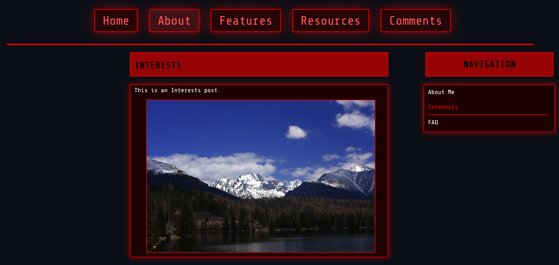
The result should look like this: