Next is to create the body of the content. The profile and the post section will share the same style, but will contain a very different format. So I will need to take that into account. But since I'm just focusing on the profile for now, I will just think about that. I made the body the same way I made the header, but with an automated height so that it can extend down as I add stuff.
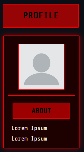
I want to add in a profile pic, so I first define a box inside the body the same way as above but by creating a new class. I also have to add in additional properties such as resizing via object-fit (W3Schools explanation)
It looks something like this:
.profile-pic{
  width: 120px;
  height: 120px;
  border: 2px solid #EF0000;
  border-radius: 2px;
  margin-bottom: 20px; /* center the image but keep some space from the bottom */
  object-fit: cover; /*ensures photo is adjusted inside the square */
}
To implement this in HTML, I used the following line and used a dummy pic. I've also commented the dummy pic if you need to use it as a WIP, as well as for credit:
<div class="section-body">
 <img src="dummypfp.png" alt="Profile Picture" class="profile-pic">
 <!--Dummy profile picture courtesty of Pixabay by WandererCreative.-->
  </div>
</div>
I wanted to create a sub-heading inside the profile body so that I can separate them into sections. As usual, I made the header the same way as before. But also, I learned that these three properties help align things in the center, which makes it easy when you're tweaking the boxes!
display: flex;
  align-items: center;
  justify-content: center;
After that I created a paragraph class to define the color and alignment. However I had one problem, everything aside from this class is center aligned when I want this to be left aligned! To fix that, I first had to check the classes of everything related to the profile section and change some of the alignments to
align-self: center;
This individually aligns each class rather than aligning as a group. Another thing was to decrease my about section header's margin from 100px to 10px. Definitely keep an eye out on the values you're using for margins because they can be trouble later on!! I spent hours trying to fix this honestly so it's on me... TT_TT
I also created a class dedicated to the text box beneath the about section and forced it to align left by using flex-start and adjusted the padding and margin for some spacing:
.profile-txt-section {
display: flex;
width:80%;
  flex-direction: column;
  align-items: flex-start;
  margin: 0px;
  padding: 0 0 0 20px;
}
So now it looks like this! I initially had the idea to include another section below the about part called description, which was more of a placeholder title than anything. I haven't decided what to do with it yet entirely, so I might leave this as is until I make up my mind.