Next up, I'd like to start building the body of my site. I'm planning to do a 3 column layout, and W3Schools seems to have just the thing. Three column layout
I'm currently following the 3 equal layouts example just to set it up. However, there's one issue. Apparently W3S uses something called floats which is outdated, and you're better off using flex for layouts because they're more responsive and less likely to break. What I did was keep the div class mostly the same except I labeled the column classes for clarity and added some dummy text for testing:
<div class="row">
  <div class="column-left">
    <h2>Left</h2>
    <p>This is the left column.</p>
  </div>
  <div class="column-middle">
    <h2>Middle</h2>
    <p>This is the middle column.</p>
  </div>
  <div class="column-right">
    <h2>Right</h2>
    <p>This is the right column.</p>
  </div>
</div>
Then I made classes for each column and defined the flex unit. Apparently they don't need to use actual units like px, vw etc. for some reason because it's meant to be used as a proportion comparison. These sites explain it:
W3Schools Flex Property
Codecademy Flex Units
Since I want my middle column to be bigger, it'll have twice the space. I then added the box-sizing which allows you to define the columns into a giant box with the padding and borders. This is so crucial because otherwise it literally doesn't appear. Lastly, for testing I added background colours. Like this:
.column-left {
  flex: 1;
  box-sizing: border-box;
  background-color: #aaa;
  padding: 10px;

}

.column-middle {
  flex: 2;
  box-sizing: border-box;
  background-color: #bbb;
  padding: 10px;

}

.column-right {
  flex: 1;
  box-sizing: border-box;
  background-color: #ccc;
  padding: 10px;
}
I also made a class for the row. The row is meant for the columns to exist in a singular horizontal space, kind of like an excel row that has a bunch of sells lined up per column. I made the display as flex to be consistent with the above, and also added a height so that it extends all the way down:
.row {
  display: flex;
    height: 100vh;
}
Now that's done, I want to start working on my profile section which will be placed on the left. I will start by creating a header, which is going to be universal throughout my site. So I'll use a common name like section-header as the class in CSS and add some common elements:
.section-header {
  background-color: rgba(210, 0, 0, 0.7);
 border: 2px solid #EF0000;
 border-radius: 2px;
 margin: 100px 50px 10px 50px; /* Format: Top, right, bottom, left */
 width: 200px;
 height: 60px;
}
Next is creating the style for the text. If you're going to use consistent text throughout, then stick to one class. But if you're like me where some sections need something different e.g. a different alignment, then create separate classes, like this:
.section-header-general h2 {
  color:#000000;
  text-align: center;

}
.section-header-post h2 {
  color:#000000;
  text-align: left;

}
Now to implement it in HTML using those classes inside each column class:
 <div class="row">
  <div class="column-left">
    <div class="section-header section-header-general">
<h2 >PROFILE</h2>
</div>
  </div>

  <div class="column-middle">
    <div class="section-header section-header-post">
    <h2>POST TITLE</h2>
    <p>This is the middle column.</p>
    </div>
  </div>

  <div class="column-right">
    <div class="section-header section-header-general">
    <h2>QUICK LINKS</h2>
    <p>This is the right column.</p>
    </div>
  </div>

</div>
Next, I need to ensure that these boxes are flexible and will have the same alignment depending on how many words are inside. If the title is long, then the box needs to extend, but not too much that it spills over another column. I used padding and margin with some trial and error and used the vw unit so that it's flexible based on the width. This is going to require a separate class that you have to add in if you want to keep the same style that's we've done so far.
First I update the common header by adding a max-width so that it doesn't overflow for all columns:
.section-header {
  background-color: rgba(210, 0, 0, 0.7);
 border: 2px solid #EF0000;
 border-radius: 2px;
 margin: 100px 50px 100px 50px; /* Format: Top, right, bottom, left */
 width: 200px;
 height: 60px;
  max-width: 100%;
}
I adjust the padding and margin so that they look properly aligned as I want in the boxes, which is centered for most headings:
.section-header-general h2 {
  color:#000000;
  text-align: center;
   padding: 0px; /* Format: Top, right, bottom, left */
margin: 1vw;
}
Then I make a new class for flexible headings. I set the width and height to auto based on how much text is in the title :
.section-header-flexible {
  width: auto;
  height: auto;
}
I adjust my post version of the heading to be similar to the general version:
.section-header-post h2 {
  color:#000000;
  text-align: left;
padding: 0px; /* Format: Top, right, bottom, left */
margin: 1vw;
}
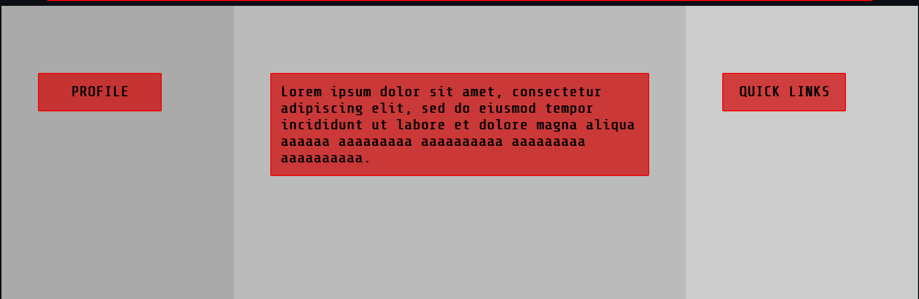
I applied all of this in HTML with the respective div classes and added a dummy text for the post to test the length:
<div class="row">
  <div class="column-left">
    <div class="section-header section-header-general">
<h2 >PROFILE</h2>
</div>
  </div>

  <div class="column-middle">
    <div class="section-header section-header-post section-header-flexible">
    <h2>Lorem ipsum dolor sit amet,
    consectetur adipiscing elit, sed do eiusmod
     tempor incididunt ut labore et dolore magna
      aliqua aaaaaa aaaaaaaaa aaaaaaaaaa
      aaaaaaaaa aaaaaaaaaa. </h2>
    </div>
  </div>

  <div class="column-right">
    <div class="section-header section-header-general">
    <h2>QUICK LINKS</h2>
    </div>
  </div>

</div>
And here's the result. The background colour is just meant to be a test to see if the columns are dividing the way I want it