Next, I'm going to try making buttons for my navigation bar. Admittedly, I didn't think about what the sizes are supposed to be on Figma, since the desktop canvas size was so massive and I just focused on getting the looks done. So I'm going to do a lot of trial and error here. W3Schools has a section about making them here (W3School Navbars) I'm following the horizontal navbar part and that kind of confused me to be honest, so looking it up it seems to be between static vs. sticky navbars (as in, it either stays in place where you want it, or it can remain in a certain position even if you scroll down). I currently want it to stay in place so I'll go with static.
What I did first was to define the buttons in HTML inside the < body > tag. This is done by using something called lists (like a regular list in common terms). There are two types of lists, an ordered list for making an actual list, and an unordered list which are more for things like bullet points. In this case, an unordered list is better by using < ul >. I defined the list as such, and then added the options I wanted by using < li >, which means list. E.g.
<nav>
 <ul>
  <li>Home</li>
  <li>About</li>
  <li>Features</li>
  <li>Resources</li>
  <li>Comments</li>

</ul>
</nav>
Next, I want to turn these into hyperlinks. I don't have any other page ready, so I need to add in a ''dummy link'' just to have it look functional. Between the < li > bit and the name of your button, add in the < a href="" > tag and remember to close it. This allows you to link things in your webpage. So it should look something like this:
      <li><a href="">Home</a></li>
  <li><a href="">About</a></li>
  <li><a href="">Features</a></li>
  <li><a href="">Resources</a></li>
  <li><a href="">Comments</a></li>
Now I want to get rid of those pesky bullet points. So I go into my .css and create a class called nav-bar, and then write list-style: none; which removes the points. In order for HTML to refer to this, I had to write class="nav-bar" inside < ul >, like this:
CSS:

.nav-bar{

  list-style: none;

}


HTML:

<ul class="nav-bar">
Next is to make my bar display horizontally instead. Go inside the class again and add in display: flex; This is called a flexbox, which started since the late 2000s as smartphones and other non-desktop devices started gaining more access to the internet in order to make it adaptable. It basically stores these elements in a container that can chance shape and size. Think of it as a liquid blob storing objects allowing you to shape it however you like. Here's my MS Paint masterpiece to demonstrate what I mean. Otherwise here's a W3Schools explanation: W3S Flexbox
Also note that any time I write a code outside of a codeblock, I always add spaces in between the < and > to prevent it from being rendered as actual code.
Once that's done, aligning it to the center is the next step by using justify-content, which is used for anything that's in a flex container like my navbar. I removed the spaces by adding padding and margins in my nav-bar class, as well as making a new nav-bar class but assigning it to the lists part specifically to give it spacing. I found a YouTube video (How to give space between two buttons in html) that suggested this method, but it does seem repetitive and I'm worried if I need to change the values especially when I don't know the dimensions yet. So GPT suggested making a new class instead to adjust it. It may not be the right method, but I'll give it a go and see if it works.
I made another class related to the hyperlink by adding the text color with color:, and added in my hex code. I converted the background color into rgba (a being alpha aka transparency) so that I can control that part. I used this site to help me convert it (RBGA to Hex). Lastly I added in the border which uses this format (border size px, border style, border color). It currently looks a bit like this:
.nav-bar{
  list-style: none; /* Remove bullet points */
  display: flex; /* Add flex container */
  justify-content: center;

}
.nav-bar li {
  margin-right: 10px; /*Add spacing*/
}
.nav-bar a {
    text-decoration: none; /* Remove underline */
    color: #FF5A5A;  /* Bright red text */
      background-color: rgba(51, 0, 0,0.65); /* Dark red background */
        border: 2px solid #FB0000;/* Red border */
}
I noticed the text looked squished, so I added spacing by using padding in the .nav-bar a class and messed around with the values until it looked right. I also increased the font-size which also increases the button size overall, so that it's more readable. I also remembered giving the border a bit of a rounded look so that it doesn't look overly pointy by using border-radius. It currently looks like this:
    .nav-bar a {
text-decoration: none; /* Remove underline */
color: #FF5A5A;  /* Bright red text */
background-color: rgba(51, 0, 0,0.65); /* Format: r,g,b,alpha. Color is dark red. */
border: 2px solid #FB0000;/* Format: border size, border style, color (bright red) */
border-radius: 2px;
display: inline-block;
font-size: 2rem;
padding: 10px 20px;
}
I also increased the text size and adjusted the spacing of the title text by using font-size, padding and margin:
.main-title {
  text-align: center;
  color: #FF0000;
  font-size: 7vw;
  padding: 0px;
  margin: 5px;

}
I also want my buttons to change color on hover. There are two ways of doing this: hover, and active. W3Schools has sections on both:
W3Schools Select Active
W3Schools Select Hover
I initially went with hover, but switched to active after implementing the next step.
I also want my buttons to stay that color when it's selected, and then go back to the regular color when another button is selected. For some reason, it's really difficult to find resources for this so I had to resort to asking GPT. Turns out, you'll need to use JavaScript (JS for short) for this. If you don't know, JS is a programming language that's often used in web development among other things, and you can do a bunch of cool things with it (although it's a bit more complex than HTML and CSS). It's been a looong while since I used it so I'll need to relearn everything.
Start off by making a tag in the body section of your HTML file:
<script> </script>
If you're planning on using JS in your website often, then you're better off making a new file dedicated for it, otherwise keep this as is. Also, W3Schools covers JavaScript as well, so definitely take a look as I'll be writing with the assumption that you know the basics. I'll still try to keep it simple.
If you're going use JS, make a new file ending with .js as the file format. Then change the script tag to the following:
<script src="insertfilename.js"> </script>
src means source, so this means that JS is going to be referring to this specific file for all your JS needs.
Now wherever you're going to be using JS, you'll need it to recognize events such as button clicks, hovers, etc. aka specific user actions. You do this with document.addEventListener ("DOMContentLoaded", function ().
Document is very often used in JS to refer to the file in question. addEventListener is a method of looking out for certain actions like the ones I mentioned above. The format is uses is ("eventname",function() { do the thing you want it to do }); For the event name, I'm using something called ''DOMContentLoaded'' which allows this method to execute first before everything in the page (such as images or anything that takes a while to load) fully loads, so it's a bit fast. This article helps explain it: DOMContentLoaded explanation
Now that there's something out there acting as a way to prioritize things before my page loads, you want to tell JS that I want it to focus on my buttons. To do this, declare a constant variable (const) and use document.querySelectorAll("insert CSS class name"); This will help JS focus on everything related to this class.
Note: JS requires all the code to end with semi-colons like with CSS unlike HTML. You're likely to encounter errors many times just because you missed a semi-colon somewhere. It happens!
Next, you want the focus to narrow down even further, because computers require that many instructions to do really specific things. To do that use the name of your const and use the method forEach (to check for each object in this constant) and then use an arrow function. This arrow function is totally new to me as I learned the old ways of defining functions way back. It's basically the modern way of writing functions in a shorter way, but I'm not sure how often is it used.
You then define your link function with a addEventListener method again, and use the click event (because this is related to mouse clicks) and define another function again. Define your const with a forEach method, which checks for each element. You want one button to stay coloured, while the others are in their default state. you do this by first making sure that all buttons in the class aren't in the active state first by using functionName.classList.remove("active"), making them in their default state. To enable the specific button as active, you write this.classList.add("active");
The code looks like this:
document.addEventListener("DOMContentLoaded",function(){
  const navBarLinks = document.querySelectorAll(".nav-bar a");

  navBarLinks.forEach(link =>{
    link.addEventListener("click",function(){
    navBarLinks.forEach(link => link.classList.remove("active"));

    this.classList.add("active");
  });
  });
  });
To test it, add in dummy links in your HTML if you don't have any other webpage yet. Something like this with the hashtags. Just ensure one of the buttons has the active class for this to work:
  <body>
<script src="script.js"></script>


<h1 class="main-title"> WELCOME </h1>
<nav>
 <ul class="nav-bar">
  <li><a class="active" href="#home">Home</a></li>
  <li><a href="#about">About</a></li>
  <li><a href="#features">Features</a></li>
  <li><a href="#resources">Resources</a></li>
  <li><a href="#comments">Comments</a></li>

</ul>
</nav>

  </body>
Also if it doesn't work, make sure that your active class isn't a pseudo-class! Pseudo-classes focus on the state of something rather than requiring the name of a class when referring to something. But this doesn't change the HTML in the way that we want, so use an actual class by switching the colon to a period.
Now for the pretty part to make my buttons glowy! I followed this tutorial I found online which shows two ways of making glow effects. I went with box shadow because it works a lot better compared to drop shadow, which bled beneath the text as well: Neon Buttons by Hackernoon
Lastly, I added a horizontal line to act as a separator for the elements. This is by using the < hr > tag in HTML. If you want to customize it, you need to name a class inside it, and then go into your .css file and create a class. If you just want to change the colour, then use color:;. But if you want to change the thickness too, I found a link that explains better practice: Change thickness in CSS
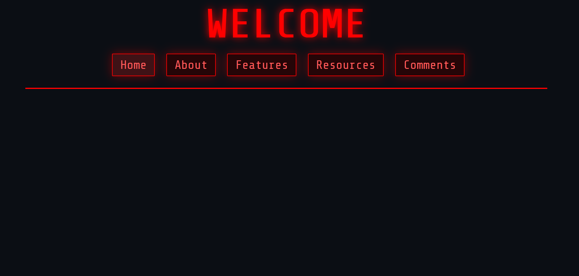
And voilà! Here's what my header looks like!