STEP 6:
Recreate your panels and reiterate them
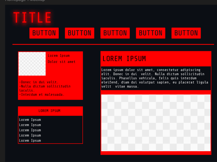
Next up is creating panels. This is done with a combination of using the shape tool (such as a rectangle), lines for dividing, text, and colors. You can then group them or create components if you need to use them repeatedly or just want to move them around. I made this at the moment. I'm not happy with how it looks, as sometimes what looks nice on paper doesn't look so good in practice. So I'll be spending some time messing around with the layout as well as testing other iterations I've made on paper. Doing this on Figma does make things easier compared to paper (which is mostly brainstorming)
Also if at any point you feel like you need to go back to the drawing board, you can definitely do that now! Look at more refs and study how they implemented their layouts, and why they are placed that way.
I went back to the drawing board and looked at my mood board. One issue I found with the aesthetic I'm going for is that a lot of the references I found from movies are often used in military or spaceflight situations, which aren't exactly suitable to fully translate to web design. This is why it's a good idea to find images that closely resemble existing web design to make things easier.
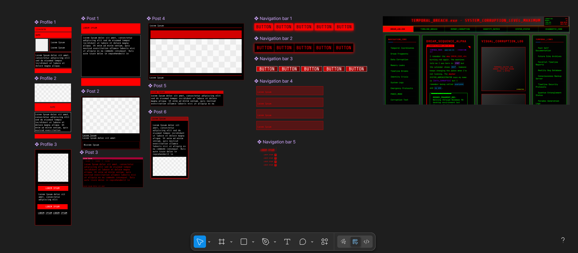
What I did was hop on Tumblr and try to find random blogs that still use custom themes to this day and study certain layouts and replicate them. I also happened to come across an account that has done a splendid job in making the style of UI I'm going for (Numbpill3d for those interested. They even have themes for neocities that you can purchase:Numbpill3d's Tumblr site). I took a bunch of screenshots and replicated the styles on figma to try different layouts and see what I like. One thing I realized is that a change in value for the colour, as well as opacity, and contrast makes a big difference in making your UI look nicer.
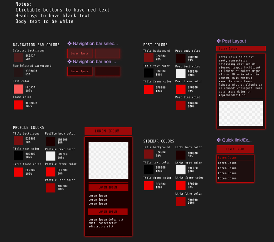
I made some final iterations to what I want the UI to look like. I focused on two things here:
1) Create a uniform color scheme so that the hex codes are consistently use rather than have different shades of the same hue by accident.
2) Make the colours more accessibility-friendly.
This is kind of tricky, because on one hand you'd want your text to be readable. But this also means sacrificing the ideal colors you have in mind. I've currently added a middle ground where it passes a few checks just to make it a little more readable, but it's probably not readable to many. If I do find that a lot of people find this site hard to read though, I'll definitely crank up the contrast to make it easier!
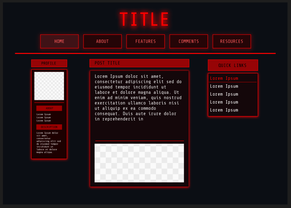
This is what my current mockup looks like for the homepage! I labeled them to get an idea of what I want to make, although I might change this later on if I have other ideas. I also showed two kinds of buttons (red highlighted and black) to show the difference between what it looks like if it's selected/hovered on and the default version. The aim is to replicate this as close as possible in HTML/CSS. We're also going to have to replicate all these steps for all the pages you need to make. But if you're sick of designing and want to jump straight into coding for a change of pace (or if you're done designing already), then check this step!