STEP 5:
Creating the mockup
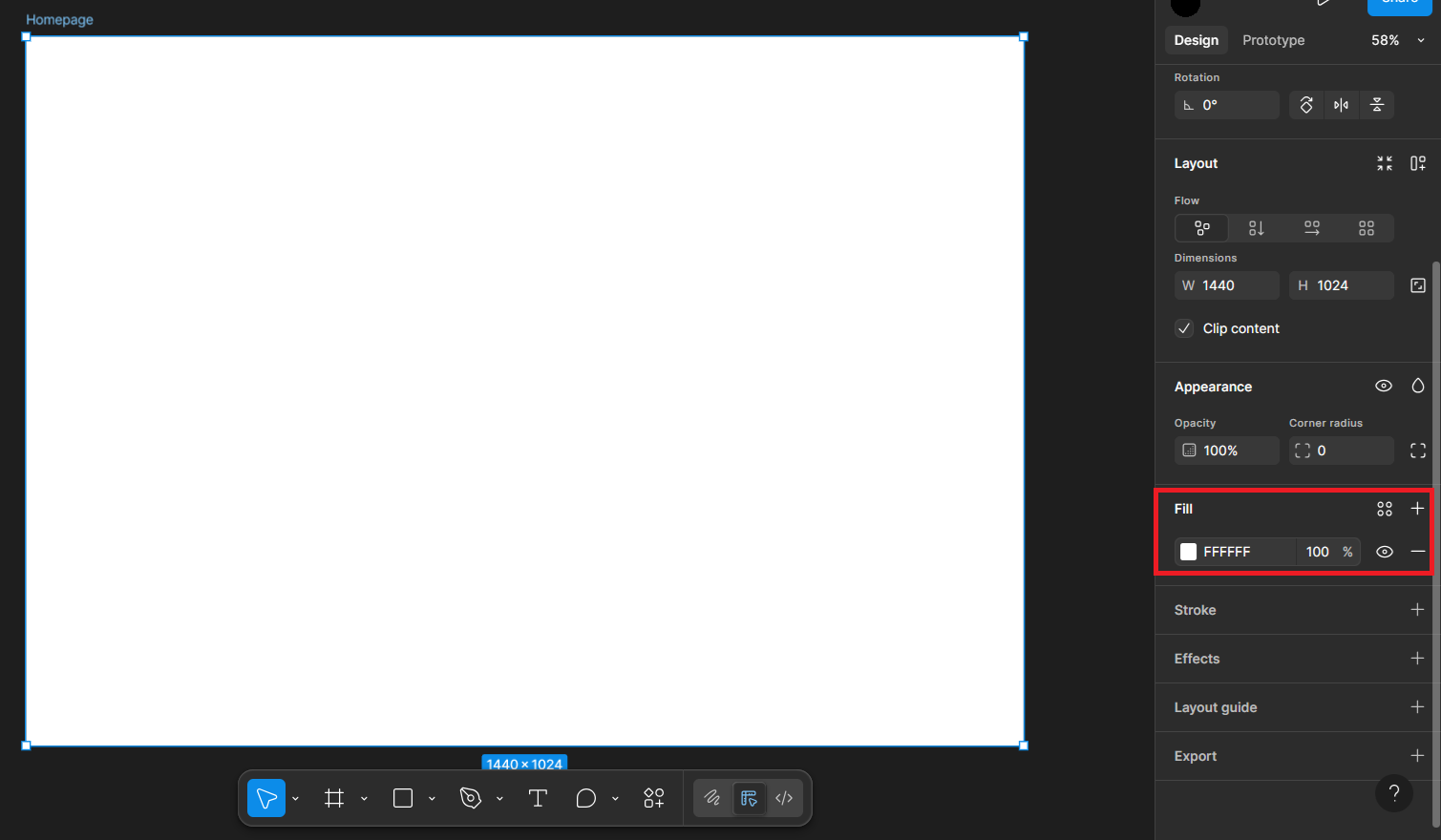
I'm going to be changing the background of this space to a dark color. To do that, scroll down until you find the fill option. You can choose a colour from there by pressing the coloured square, or if you have a hex code in mind, just replace the code by clicking on it.
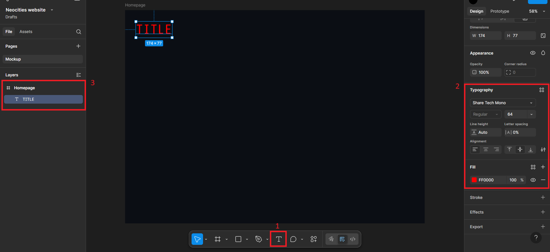
Next I'm going to add some text. If you look down to where you found the frames button, you'll also spot a Text button with a T icon (labelled 1 in the image). You can also press T on your keyboard as a shortcut. Doing that changes your cursor to a crosshair, to which if you click anywhere, summons your text. Drag it where ever you like, and also use the options on the right to change the alignment (Position section). To change the typeface/font, scroll down to Typography (labelled 2 in the image) and choose from a list of options. You can also change the size, and the colour like how you did the background.
Also if you notice on your left, there's a new element in your layer section! Figma typically names them automatically, but if you want something specific, you can always rename them. It also automatically groups them under the active layer so that it doesn't spread to other pages you might be making. But you can always move things around if you need to.
Also I wanted to add a neon effect to my text. You'll probably realize this by the time the website is done, but I'm aiming for a retrofuturistic aesthetic and I'm building this website as i'm writing down this tutorial lol. So who knows, this could also be a conceptual log of previous iterations if this neon thing doesn't make it in the future. Anyways, if you're interested in making a neon effect too, I used this tutorial:
Neon text in Figma
Next is creating a button for whatever needs an interaction in your site. Normally I used to just make a rectangle and add text on top of that, but I thought to learn a better practice this time. You're free to make a rectangle and text if you want! I learned Figma's way of doing it through this link:
Design your first button
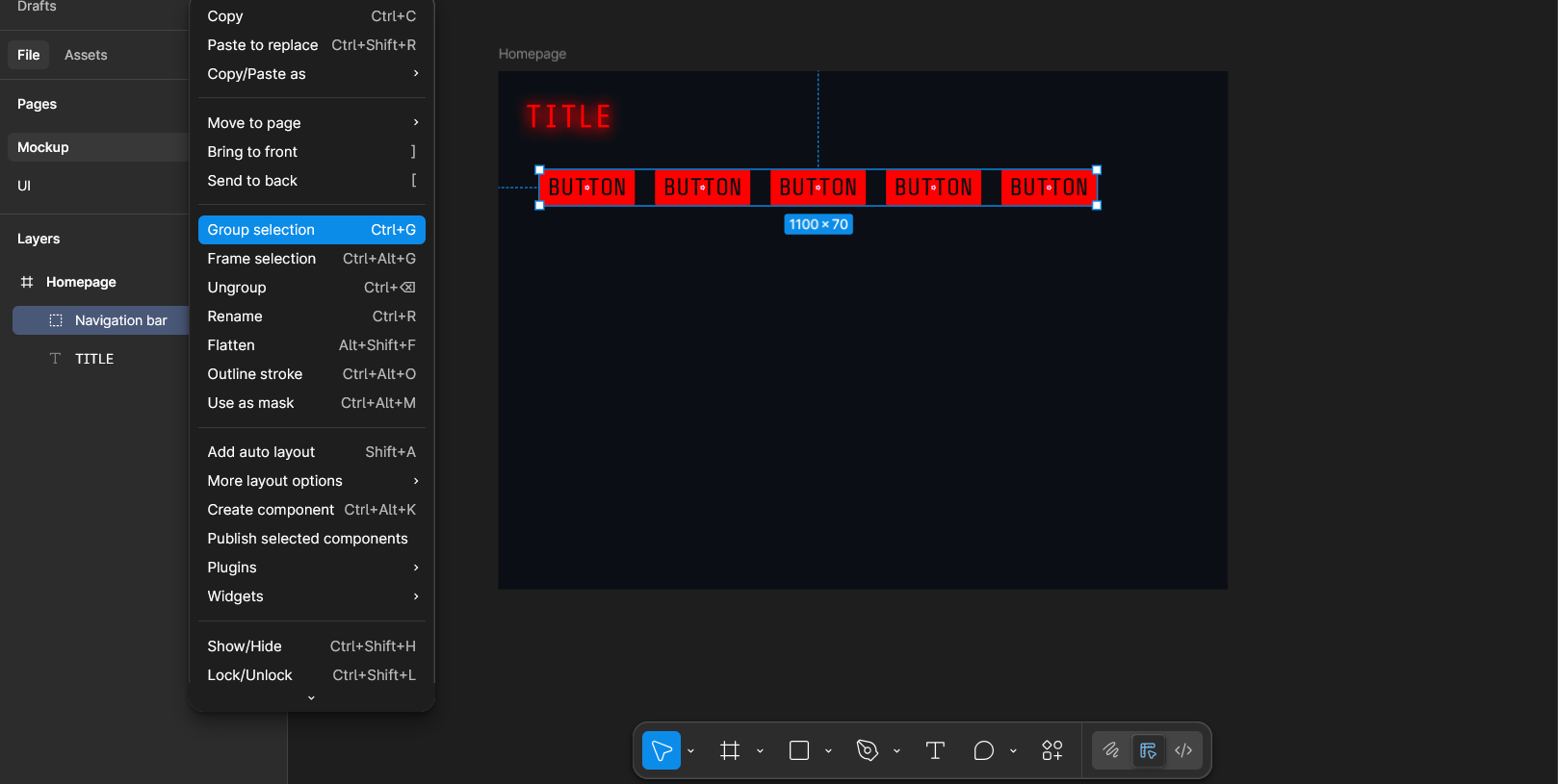
Also you can group clusters of elements if you want, such as a group of buttons, etc. by right clicking on your selected elements and clicking on group selection, or pressing Ctrl + G. The output creates a little folder of sorts, like in the image.
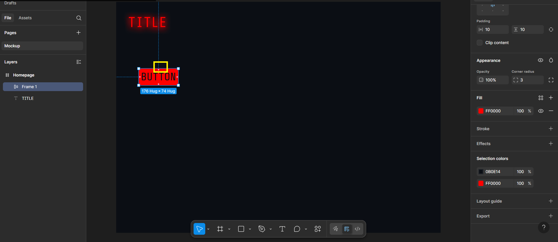
TLDR: Create a text layer with your chosen text, and then press Shift + A to create an auto-layout which makes it easy for it to resize. Select your fill colour and text colour in the properties, and change the corner radius in the Appearance section. Zoom in to your button to see little handles inside the button (highlighted as yellow box in the image) that allow you to change the padding as you like. Lastly, convert it into a component in the right area by clicking on the four circles icon next where it says Frame, or press Ctrl + Alt + K.
Remember to rename your layer once done!
I think right now is also a good idea to create a new page to keep all your UI components in one place, so that you can easily copy and paste them, rather than having to repeat these steps from scratch. It's best to do this when you're absolutely confident that you're not going to change them much, or else it's going to be a pain to deal with.